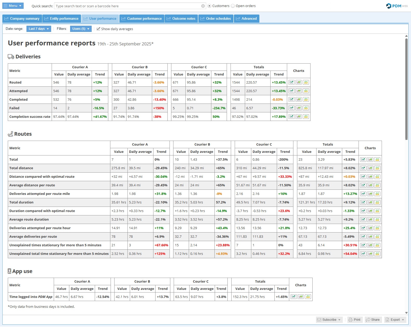
User Performance Report
This report allows pharmacy managers to get quick insights into the performance of delivery drivers, providing easy comparisons between drivers and identifying developing trends.
Report features
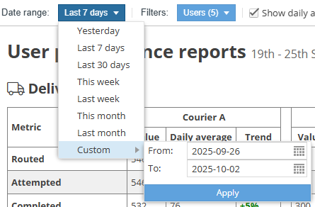
Choose the date range for the report with an easy preset or enter a custom range:
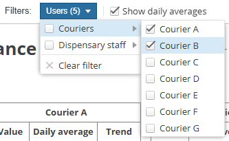
Choose which users to show in the report:
Show daily averages checkbox: 
This shows and hides the “Daily average” columns in the report. By default it is unchecked so that the report is initially shown in its simplest form.
The chart buttons  open a pop-up chart that provides easy yet powerful visualisation of the selected metric:
- A line graph that plots the values of the selected metric day-by-day over the selected time period. Allows users to easily spot trends and peaks.
- A bar chart that compares the values of the selected metric for each user. This allows you to quickly compare performance of your delivery drivers.
- A bar chart that groups the values of the selected period by time periods. For example, if you have selected a date range of one year, it will show the totals for each month of that year for quick comparison and trend-spotting.
Subscribe:
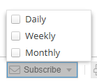
Subscribe to receive a copy of this report on the selected frequencies (daily, weekly, monthly).
Print: 
Send the report to a printer.
Share: 
Share the report with someone by email.
Export: 
Export the report in Excel format.